
Hello Power Addicts, hope all of you are doing great. Well today, I am going to discuss in brief of how we can start with creating a simple yet beautiful Waffle menu in PowerApps Canvas App as shown below.

Let’s begin.
Step 1. Create a new canvas app and add the controls (label and waffle icon) as shown below. Make sure the order is maintained.

After adding these two controls, we will create the area which will act as the waffle menu. So, we will add a rectangle as the waffle menu canvas and then insert labels and gallery.
Change the Fill property of the rectangle and other controls as per your design requirement. In my case, I have used RGBA(237, 237, 237, 1) as the Fill color for the rect_waffleArea control.
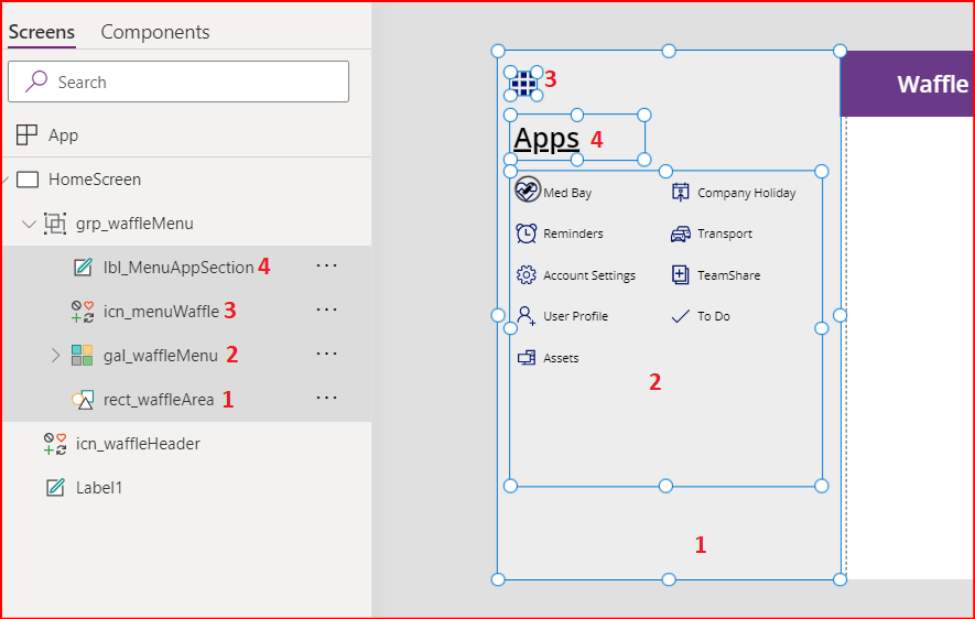
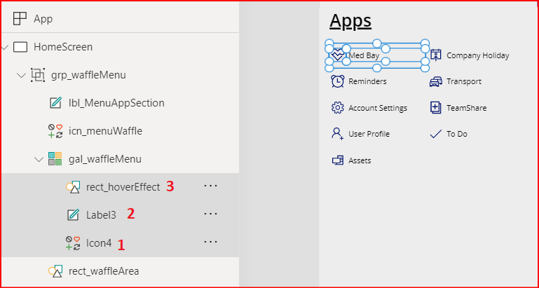
Step 2. Let’s configure the gallery. Add an icon, label and rectangle controls in it. (Do not worry about the data displayed in the gallery yet. We will set this up too in the following steps.)
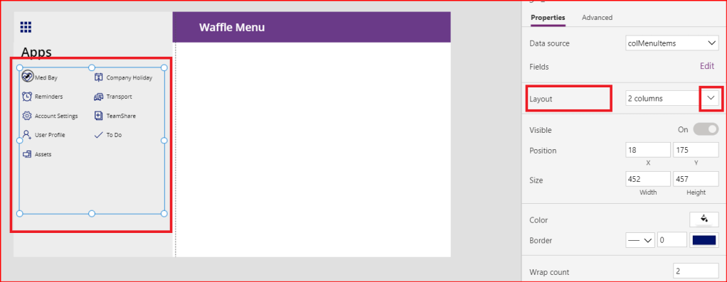
In my gallery, there are two columns which displays the menu items. We can set this from the layout property of the gallery control. So, lets select the gallery and click on the drop down arrow to select the 2 columns layout as shown below.

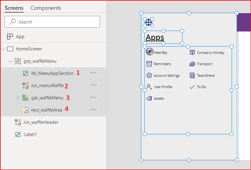
Step 3. Group these controls ad give the name the group a name, such as grp_waffleMenu.
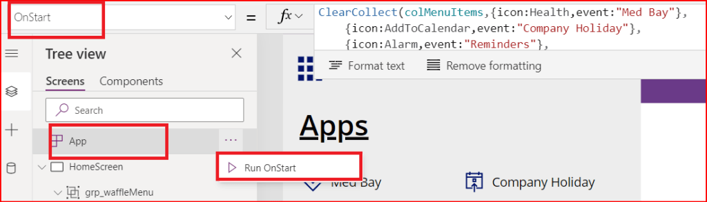
Step 4. Now we will initialize a collection colMenuItems in app OnStart property. This collection has two columns, Icon and event, which stores our menu items data.
The below code can be used to initialize the collection.
ClearCollect(colMenuItems,{icon:Icon.Health,event:"Med Bay"},
    {icon:Icon.AddToCalendar,event:"Company Holiday"},
    {icon:Icon.Alarm,event:"Reminders"},
    {icon:Icon.Cars,event:"Transport"},
    {icon:Icon.Settings,event:"Account Settings"},
    {icon:Icon.AddLibrary,event:"TeamShare"},
    {icon:Icon.AddUser,event:"User Profile"},
    {icon:Icon.Check,event:"To Do"},
    {icon:Icon.ComputerDesktop,event:"Assets"}
)

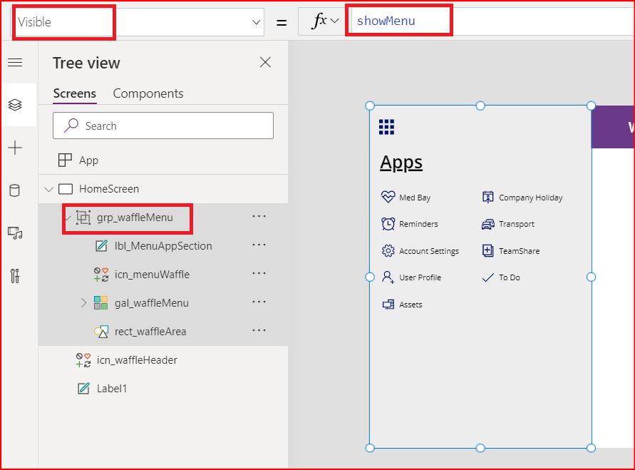
Step 5. When we start the app and the screen loads, the waffle menu should be hidden. To control the visibility of the waffle menu, we will use a variable showMenu. This variable is set to false when the screen loads.

Step 6. Select the Grouped component and set its visibility using the variable showMenu.
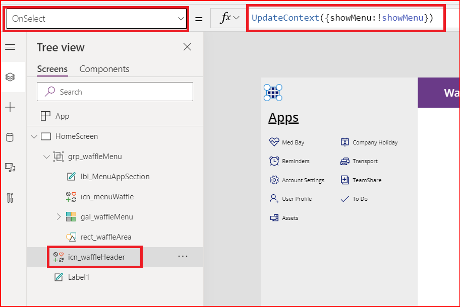
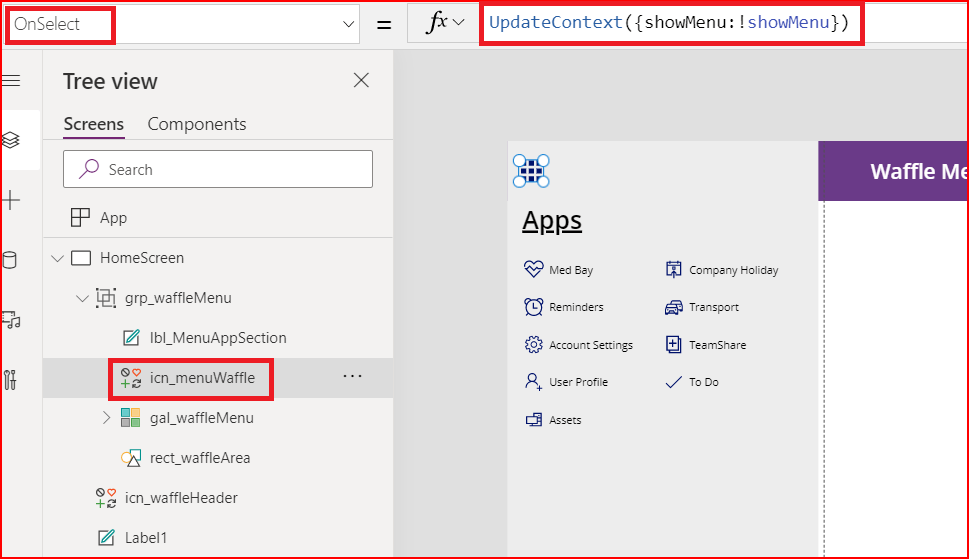
Step 7. Now we are going to add a piece of code in OnSelect property of some controls to maintain the visibility of the waffle menu. The piece of code I am talking about is:
UpdateContext({showMenu:!showMenu})
- Control 1. From the tree view, select the waffle icon which is present on top of the header label and not inside the waffle menu grouped components.
- Control 2. the waffle icon inside the group components.
- Control 3. The rectangle control inside the gallery.

Note: Here, I have also added a piece of code to display notification as to which menu item was clicked. Here you can change the logic as per your requirement like navigation to another screen, launching another app and so on.
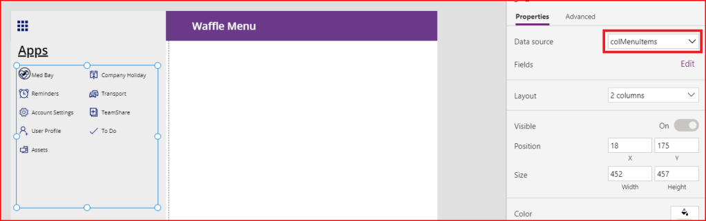
Step 8. Let’s configure the gallery now.
- Set its Datasource to the collection colMenuItems.
- Set the Icon property of the icon control to ThisItem.Icon
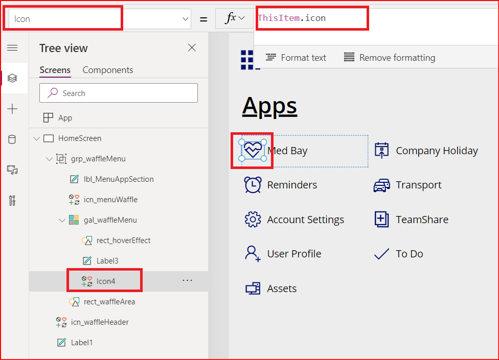
- Set the Text property of the label to ThisItem.event

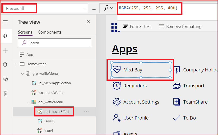
- For the rectangle, update the HoverFill property.

Also update the PressedFill property value.
Now, we are all set. Run the App OnStart and play the app.
Play the App and we have our brand new waffle menu in action.
This is a very simple way of how we can start with waffle menu. Now by changing the datasource to some SharePoint List, or a Dataverse table along with cosmetic changes, you can create enhanced waffle menu for your canvas apps.
I hope you find this post helpful. Thank you for sticking by. See you in the next blog.
 Power Platform Tips and Tricks
Leave a comment