
Do you also want to use a dropdown menu like the one shown below in your Canvas Apps?
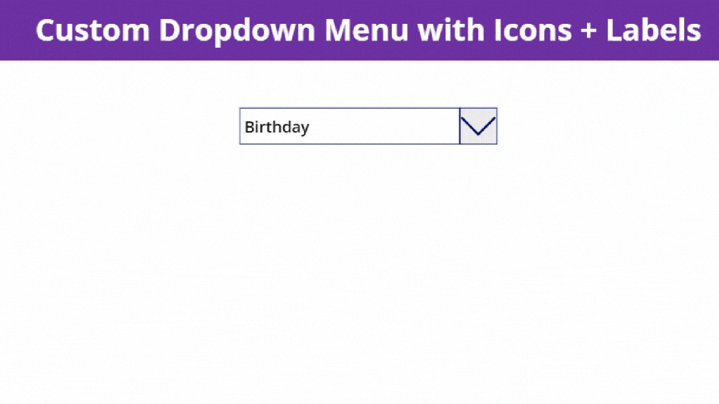
Well, welcome to another day, another blog and without wasting any more time, let’s dive in to PowerApps Studio and create a dropdown menu like this one.
Step 1. Create a new canvas app and add the controls as shown below in a screen. I have renamed them as well.

Here, I have intentionally left out the control rect_hovereffect. We will add it later.
Step 2. Add the below code in App OnStart property. Use this to initialize your menu list using a collection.
ClearCollect(
    colEventTypes1,
    {icon:Icon.Health,event:"Leave"},
    {icon:Icon.AddToCalendar,event:"Holiday"},
    {icon:Icon.Clock,event:"Birthday"},
    {icon:Icon.Airplane,event:"Travel"},
    {icon:Icon.Alarm,event:"Medical Emergency"}
);

Inorder to populate the collection colEventTypes1, click Run OnStart.

Step 3. Create a variable to control the visibility of the gallery where menu items will be displayed. Inorder to achieve this, add the below code to the OnVisible property of the screen, in my case HomeScreen. When the screen is visible we do not want to show the menu items of the drop down, hence the variable showdropdown is set to false.
UpdateContext({showdropdown:false})

Step 4. Set the Visible property of the gallery gal_eventlist to the variable showdropdown.

Step 5. Set the DataSource of this gallery gal_eventlist to the collection colEventTypes1.

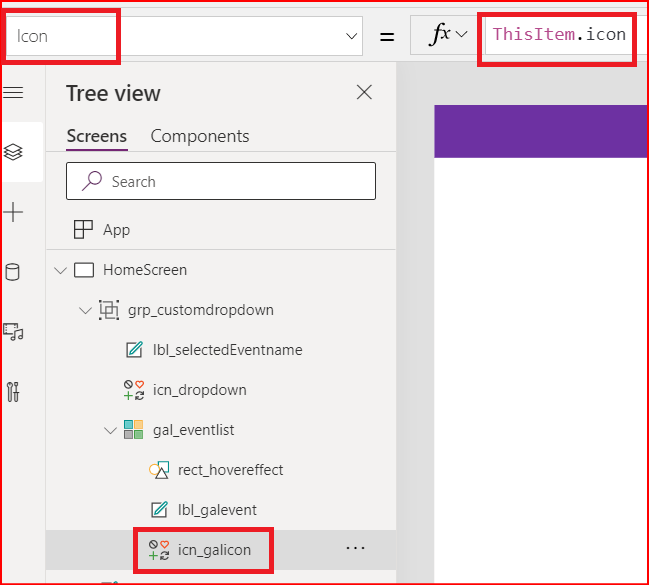
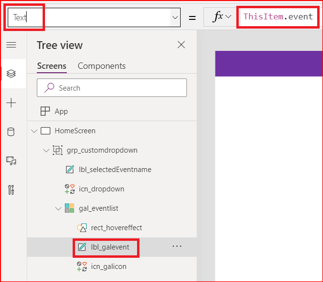
Step 6. Set the Icon property of the icon control icn_galicon to ThisItem.icon. Also set the Text property of the label lbl_galevent to ThisItem.Event.
Step 7. In the OnSelect property of the control icn_dropdown, add the below code to update the value of the variable showdropdown. With this code, whenever the value of the variable changes, the gallery will be shown or hidden because of Step 5.

Step 8. Let’s add a rectangle inside the gallery and keep it on the front of the icon and label controls. Whenever, the gallery is displayed and one of the menu items is clicked, it will happen basically by clicking on this rectangle.
When an item has been selected, the gallery should be hidden again. So, let’s add the below code to the OnSelect property of this rectangle control.

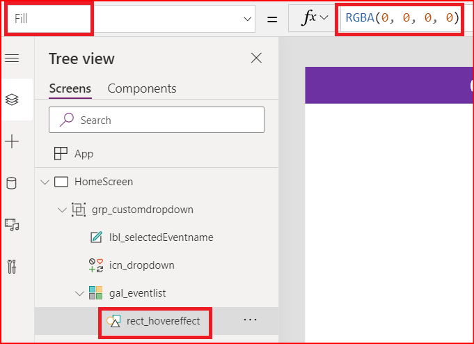
Inorder to make this rectangle transparent, I will use the following color code in the Fill property of the rectangle.
And to change the hover color and make the icon and text visible during hover, lets update the value of its HoverFill property.

Step 9. Add the below code to the Text property of control lbl_selectedEventname so that whenever an item is selected from the dropdown gallery, it is shown in the label control.
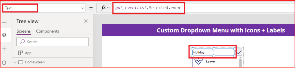
gal_eventlist.Selected.event
Step 10. Finally, select these controls except lbl_header and group them. Save the app.
Now we are ready with our custom dropdown control and when you play it, it will behave as below:

This is an idea and I believe that this control be extended to meet various needs such as using an Input Text Control instead of the label control and implement Search functionality. Also, multiple selection of the items from the drop down and the list may go on.
So I hope you find this post helpful and thank you for sticking till the end. See you in the next post.
 Power Platform Tips and Tricks
Leave a comment