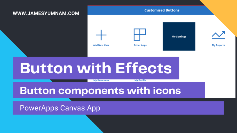
Many a times, we have come across situations where we want to create nice and stylish buttons on a home screen or a dashboard such as shown below.
Button component using Icon, Label and Button Control
In PowerApps, the out of the box button controls do not support such properties yet. We cannot insert an image or icon inside a button. So, in this blog I am going to show simple step by step process to create a custom button component and use it in our app.
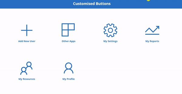
Use Case Definition: We have certain screens in our app and we have a Home Screen which will contain our custom button components and on the click of each button components, it will navigate to the desired screen as shown below:
Screen Navigation using CustomButton components
Tabel of contents
- Pre-requisites
- Setting up demo App
- Creating Custom Button Component
- Using the custom button component
- Custom Buttons with Label and Icon in Action
Pre-requisites:
This blog assumes that you have fair understanding of working with PowerApps Studio and it’s features. Also, it is assumed that you are familiar with designing screens using various controls.
Setting up demo App
To start with this app, let’s create a new Canvas app in the PowerApps Studio.
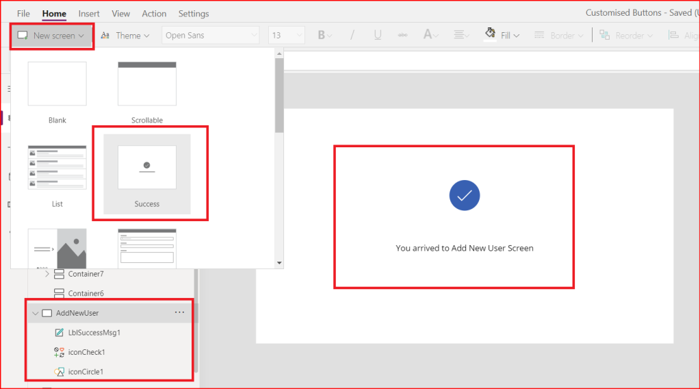
Let’s add three screens in the app: HomeScreen, AddNewUser and OtherApps.
Let’s keep the Home Screen blank for now. But for the other two screens I will design them simply by adding a New Screen and use the Success template. I have changed the label Text property to You arrived to Add New User Screen and You arrived to Other Apps Screen respectively.
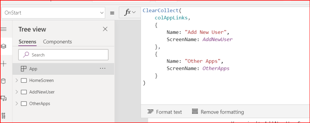
Now, in the OnStart property of the App component, I will add the below code. This will create a collection named colAppLinks which contains two columns: Name and ScreenName.
Creating Custom Button Component
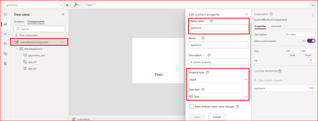
Now, I will create a New Component called customButtonComponent. And the first thing I have added to this component is a custom input property called appName. I have done it by clicking on New Custom Property in the Properties pane. This property will be used later to set the name to refer to which screen it should navigate to. This name inout should be one of the values in the Name column specified in the collection colAppLinks.
I will start adding the three controls Label, Icon and Button in this component.
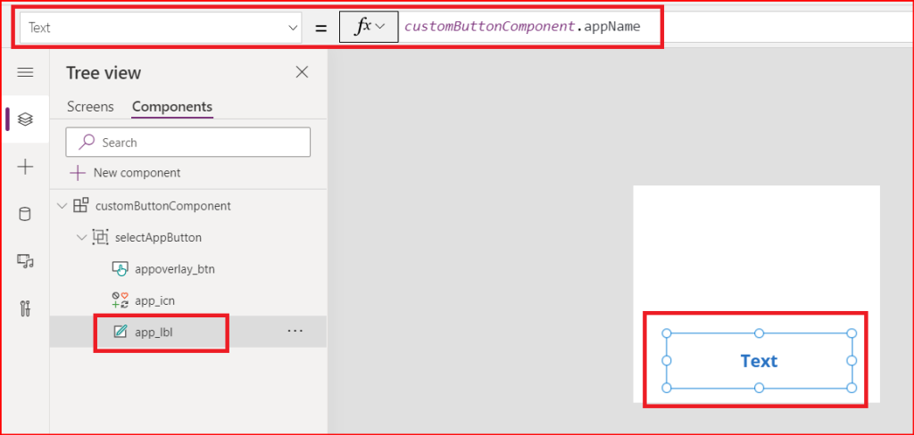
First add the Label and rename it to app_lbl. Its Text Property is set to appName which is the custom input property I have created above. So this will display the name of the app to which the button will navigate before hovering on it.
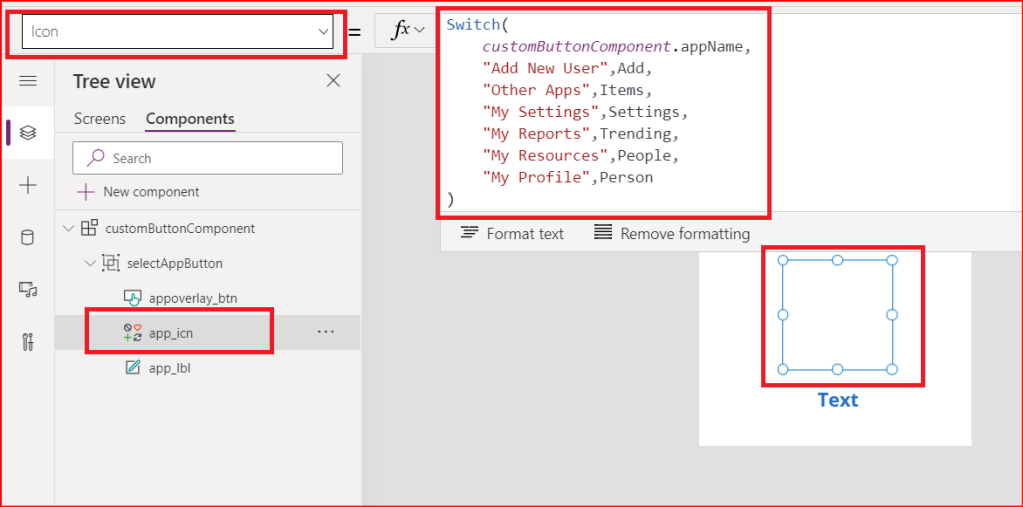
Next, insert any icon from the Insert menu and set its Icon Property to the following code as displayed in the below screenshot. Here, I am defining the icons to be used for each screens. (you can use any icons of your choice)
Switch(
    customButtonComponent.appName,
    "Add New User",Icon.Add,
    "Other Apps",Icon.Items,
    "My Settings",Icon.Settings,
    "My Reports",Icon.Trending,
    "My Resources",Icon.People,
    "My Profile",Icon.Person
)
Last control to add is the Button control in front of the label and icon controls.
Set the OnSelect property of the button to Navigate(LookUp(colAppLinks,Name = app_lbl.Text,ScreenName))
So, according to the name of the screen which is provided into the component, it will navigate to the respective screen by searching for it from the collection which I created in the beginning in App OnStart property.

Also, set it Fill property as below:
Fill = ColorFade(RGBA(25,25,112,0),-50%)
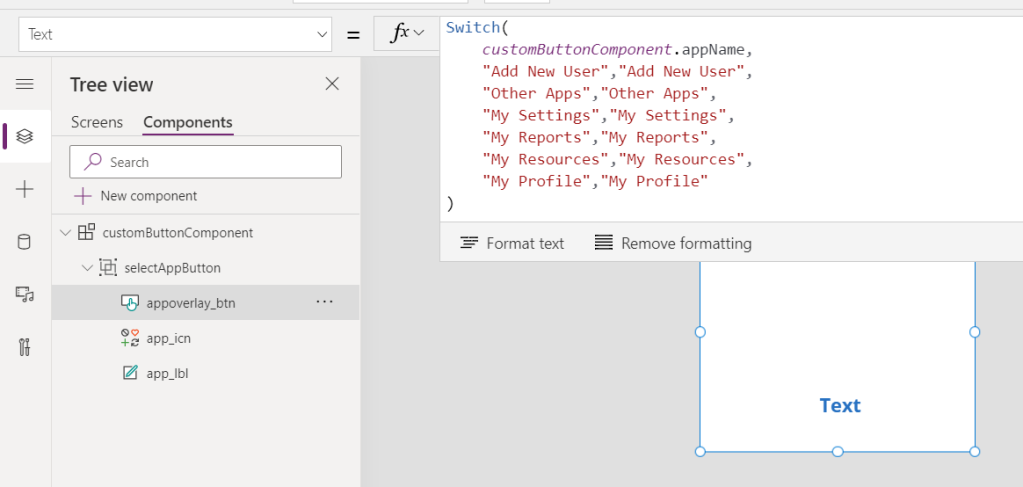
Now on hover of this button control, I want to change the color of the background and highlight the screen name only. The screen name will be displayed as the Text property of the button.
So, I will set the Text property of this button control to the following code: which means if I give Add New User as input to the appName property, the Text property of the button will be set to Add New User. And this text will be visible on OnHover only because of the color code.
Switch(
customButtonComponent.appName,
"Add New User","Add New User",
"Other Apps","Other Apps",
"My Settings","My Settings",
"My Reports","My Reports",
"My Resources","My Resources",
"My Profile","My Profile"
)
The above will become handy if you want to display headers on the Label and Button overlay text.
Or if you want to keep the text same for both label and button overlay, simplify the code as:
customButtonComponent.appName
Also, I want to hide the label and the icon on hover, so I will fill the button background on hover with this code.
HoverFill = ColorFade(RGBA(0, 96, 178, 1), -50%)
Once this is done, I will group these controls by selecting all three of them and selecting Group after right click. I will rename the group to selectAppButton.(even if you do not group, it is fine).
Now our button component is ready. And I will use it in my Home screen.
Using the custom button component
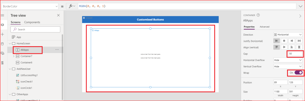
I added a blank screen in the app in the beginning. Inside this screen, I will add a Horizontal Container where the button components will be inserted. Make sure you give the requried Gap property value to provide gaps between the button components to be inserted inside the container.
Also turn On Wrap property. This will make sure that button components do not overflow and remain inside the container.
Now from the Insert (+) option in the left hand side, under Custom , I will select the customButtonComponent which I have created. Similarly, I will add the components as many times as I want inside the container.

I will also rename each components to their suitable names in the navigation pane. And inorder to update the Text property of the label and the button, and the Icon, I will give name of the screens to each custom button component.
Below screenshot shows how I have done for Add New User button component. Repeat the same for other button components too. Give the appName as Other Apps, My Settings etc.(as per how I have created the screen names in the collection above).

With this, the required configuration is done and the buttons are ready to be run.
Custom Button with Icons and Labels In Action
Thank you being till here. Hope you found it helpful. See you in the next blog.
 Power Platform Tips and Tricks
thanks for sharing your tutorial! just have one doubt, how do you prevent the button text from being seen overlapping the icon? for example I see white parts of “add new user” over the icon
LikeLike
Hello. thank you for reaching out. I believe you might have already fix it. but in any case, the issue exists, please check if you have placed the controls correctly and set their height and width properties.
LikeLike
Thank you for sharing!
When following your steps, I am not able to reference the collection created on the app-level in my component’s button OnSelect property. It does appear in my collections overview, but it seems im unable to reference it, when working in the components section.
How are you able to reference it?
LikeLiked by 1 person
Hi Daniel, thank you for reaching out. I checked it again by creating new collections in App OnStart and tried to access those collections in OnSelect properties of the button in the component and I am still able to reference them just as it is. Is there any error/warning message you received?
LikeLike
Hi James!
Thanks for the reply. No error, however, I did find that it was not working because I had not clicked “Run OnStart” after creating the collection. So it works fine now 🙂
LikeLiked by 1 person
Awesome!
LikeLike
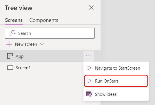
Having the same problem as Daniel. I can’t reference my collection in when putting in my component. @James What do you mean by “click Run OnStart”?
LikeLike
Thank you Dieter fo reaching out. Please check this image to see how to perform “click Run OnStart”.
LikeLike
Not sure if it’s version specific but I had to switch on ‘Access app scope’ for the customButtonComponent to allow reference to the collection.
LikeLiked by 1 person
This is great, Martin! Thanks for sharing. More details about this feature is available here: https://powerapps.microsoft.com/en-us/blog/canvas-components-can-now-access-app-scope-directly/
LikeLike
Great tutorial, thank you James!
One thing though, as someone else mentioned above, the button text is visible over the icons when not hovered. Any idea what causes that?
LikeLiked by 1 person
Hi Sebastian, thank you for reaching out. Please check if the order of the controls in the component as well as the fill properties.
LikeLike
Hi! Checked again, the order is exactly as in the pictures: Button to the front, icon next and label to the back. HoverFill for the button is set to ColorFade(RGBA(0, 96, 178, 1), -50%) and Fill of the button is set to ColorFade(RGBA(25,25,112,0),-50%)
LikeLike
Sebastian, you have to change the text color to ColorFade(RGBA(25,25,112,0),-50%) as well. I was having the same issue.
LikeLiked by 1 person
It’s still a perfect solution to my multiple screens App, thank you.
To apply on the latest version, the property “Allow customization” from the components changed to “Access App Scope” you need to turn it on.
LikeLike